Today we are rolling out our new brand identity
August 16, 2019
Welcome to our new brand identity.
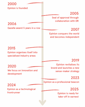
An evolving business, an evolving identity. Our new brand identity has been designed to communicate a balance between who we were and what we have become. It is an evolution – rather than a revolution. Some things about Epinion are changing significantly, such as organisational size and market conditions, and others – like our commitment to being ambitious in everything we do and analytical in our approach – will always stay the same.
We decided to embrace this by tweaking our Epinion red into calling it muted red, orange red or just Epinion red. And adding to it a fresh and creative, yet mature, palette of colours. Also, our company mantra, that numbers need stories and vice versa, has elegantly been incorporated in our new logo. We have dotted the i’s with a square symbolizing hard facts and a round circle symbolizing soft, sticky insights. A simple way to brand our fused, holistic approach every time we display our logo.
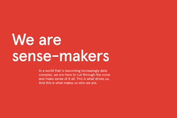
The squares and the dots furthermore act in a multiplied, disordered and chaotic form. As a symbol of an ever more data complex world triggered by an increased digitalised society – and implying multiple data sources. With our deep area expertise and data acumen we help our clients to cut through the noise. Identify patterns, see trends and make sense.
As a core part of our new brand identity, our new purpose has come alive. An intended client-oriented purpose covering our dual sector expertise and our ambition to advise clients to prepare for the future – through recommendations, inspiration, design and innovation. Our purpose aims to create clarity on why we exist. And how we contribute to a better world.
“I am excited about our new brand identity, which is about more than how we look. It is about updating how we communicate, so we can engage with our clients and the world more effectively, now and in the future as we continue to change,” Berit Didriksen, CEO.
More in Buzz

August 10, 2021
In partnership with London Heathrow Airport Epinion is nominated for two MRS Awards in 2021

September 15, 2020
